The Story Behind Our New Brand Identity
Over the last year at SPO we have better defined our brand position in the New Evangelization across the United States and align our ministry strategy with our communication efforts. Our investment in marketing and communications has borne numerous fruits, including our new visual identity.

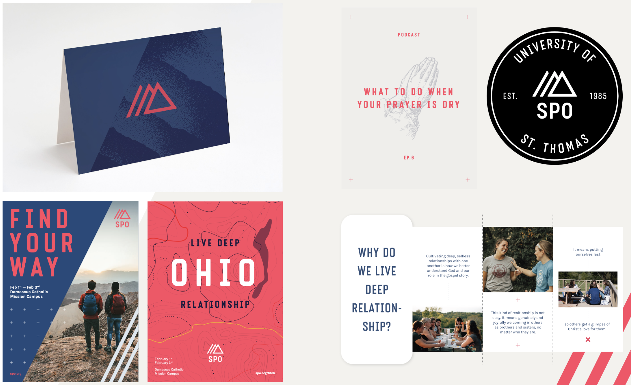
The Story Behind the Logo
The progression of the logo represents the transformation that happens within community. Each line shows the steps someone takes as they move away from isolation and towards deeper relationship with God and others. The triangle is the final stage of the progression and holds a dual meaning of community. It represents the Trinity, God in himself as Father, Son and Spirit, and also us living deep relationship both horizontally with brothers and sisters and vertically with God.
Many thanks to Glass Canvas, a marketing agency based in Vancouver, BC, for their partnership in this process.